

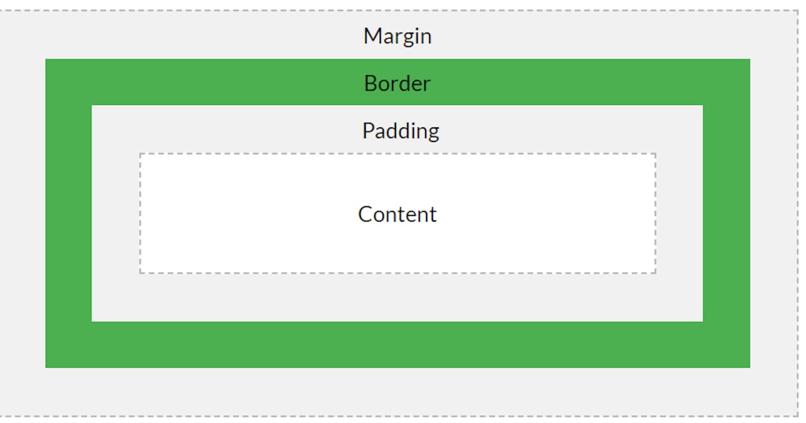


Just as you can add height, width, and border to virtually every element in HTML. Margin, Padding, and box-model are no exceptions. Although box-model is not a property with values in CSS, it is said that every element is a box that consists of margins, borders, padding, and the “actual content”.
Actual content: This is the content of the box where text, images, or even children elements appear.
Before I go into the business of breaking the above topic into BABY-STEPS, let us have a base understanding of what these properties are.
Height: The height is the vertical length any element covers at any given time. Width: The width is the horizontal length any element covers at any given time. Margin: This is the space or allowance around any element but outside its border. Padding: This is the space between the “actual content” of the element and its border.
NOTE: the body element has a default margin of 8px and has been removed to help make things easier.
Now, with the above definition in mind, let us go ahead to understand this concept of margin, padding, and the box-model.
Margin and Padding
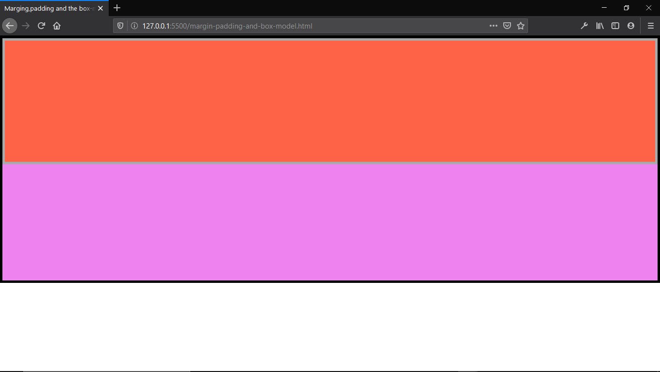
I have created a div element with a class of “main-div” and a child div element with a class of “inner-div” as shown in the code below.
<!DOCTYPE html>
<html lang="en">
<head>
    <meta charset="UTF-8">
    <meta name="viewport" content="width=device-width, initial-scale=1.0">
    <title>Marging,padding and the box-model</title>
     <style>
        .main-div{
            height: 500px;
            background-color: violet;
            border: 5px solid black;
        }

        .inner-div{
            height: 50%;
            background-color: tomato;
            border: 5px solid darkgray;
        }
    </style>
</head>
<body>
    <div class="main-div">
        <div class="inner-div"></div>
    </div>
</body>
</html>
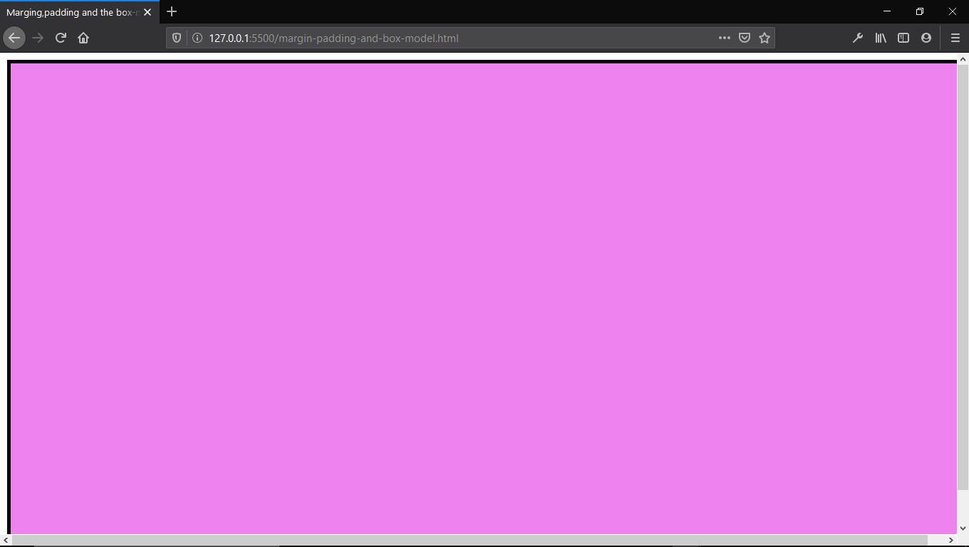
With the above code, you can also see that I styled the main-div by giving it a height of 500px, background color of violet and a border of “5px solid black”. You can read up on borders HERE if you need more clarification. Moving ahead, I gave the child div with the class of “inner-div” a height of 50% (i.e half of the parent div), background-color of tomato and a border of "5px solid dark-gray". The picture below shows the result of the styling.
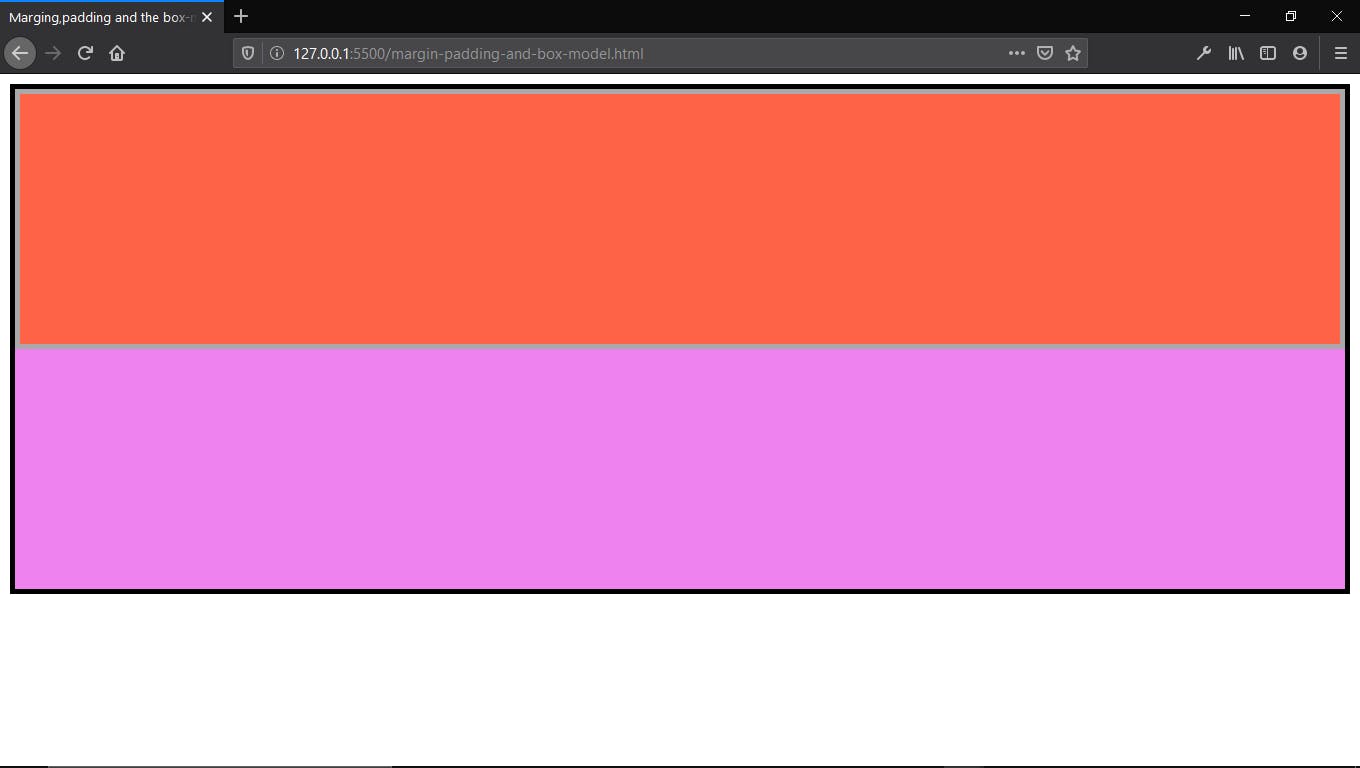
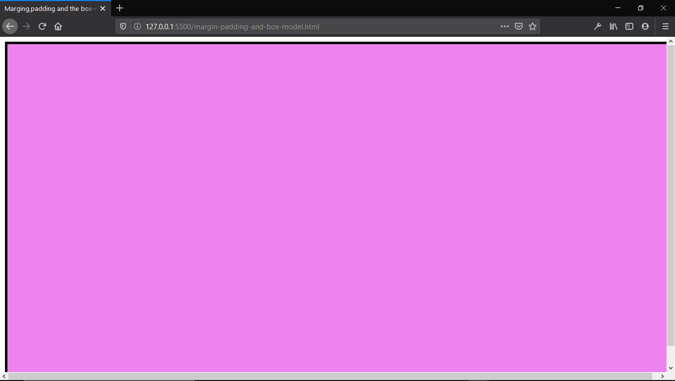
Using this as a learning tool, let’s understand margin and padding better. if i add a margin of 10px to the “main-div” i.e
.main-div {
    Margin : 10px;
}
You would notice a gap of 10px is between the “main-div’s” border and the body of the page explaining our definition that margins are created outside the element in which the margin is assigned to. (See image below).
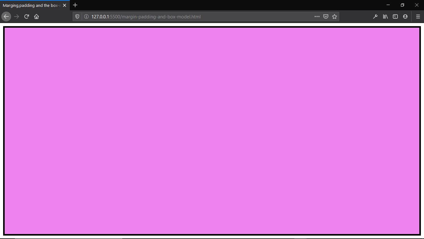
Now, adding padding of 10px to the same “main-div” (parent element) you would notice that the background-color of the parent div which is violet is now exposed because there is space between the inner-div (see pics below).
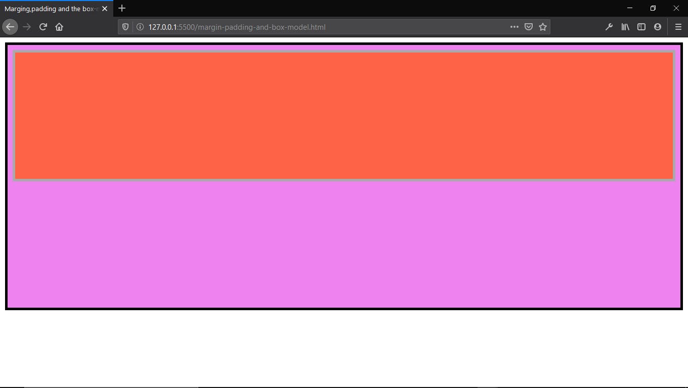
This shows that paddings are set to create spaces inside the element, unlike margin which creates space outside the element.
THE THEORY OF THE BOX- MODEL:
The theory of the box-model like I fondly call it, states that to get the actual width or height of an element, the margin, padding, and the border is added to the elements’ original width or height. i.e to get the actual height of any of the elements above, we would have to add the height of the element to the border, margin, and padding of the same element to get the actual and accurate height of the element.
For us to understand this better, I have removed the “inner-div” so we don’t confuse ourselves. Also, i have given main-div a height of 100vh (100% of the screen height) and a width of 100% (100% of the screen width).
.main-div{
            width: 100%;
            height: 100vh;
            background-color: violet;
            border: 5px solid black;
            margin: 10px;                                                                                                    }
RESULT
Notice that the horizontal and vertical scroll bars pop up indicating that the content of the webpage has exceeded the width and height of the display screen. This proves the theory is in fact true. Remember, we gave the “main-div” a border, padding, and margin of 10px each. This border, padding, and margin cover the four corners of the div (left, top, right, and bottom). So recalculating the width of the main-div, we would say ;
100% weight as indicated in our styling + 10px border, 10px margin and 10px padding on the left side of the div + 10px border, 10px margin and 10px padding on the right side of the div.
100% + 10px + 10px +10px + 10px + 10px + 10px = 100% + 60px.
For my screen size, 100% of my screen is = 1092px.
1092px + 60px = 1152px
1152px is greater than 1092px (100%) of my screen and that is why my webpage is overlapping.
If we do the same for the height, 100vh which is 100% of any screen height, and for mine is = 595px + 60px ( 20px border for left and right sides, 20px margin for left and right sides and 20px padding for left and right sides) = 655px. This is more than the screen height which is 595px and that is why we have the vertical scroll bar out.
To combat this issue of having to calculate these things which may bring up unwanted alignments in a bigger project, CSS has the BOX-SIZING property to help. This would be a topic for another day but my favorite box-sizing value is the border-box. The border-box makes the border and padding included in the actual size i.e the content of the main-div. So if we put
Box-sizing : border-box;
In our CSS styling of main-div, you notice that the scroll bars are not gone.
 This is because the margin (space outside the element) is not added to the width or height of the element. To finally eliminate this, we can then used the "CALC" method in CSS i.e
Main-div {
    width: calc(100% - 20px) ;
        Height: calc(100vh - 20px) ;
}
Where Calc is the method for calculation, 100vh is the height of the main-div, and 10px is the margin given to main-div. or always remember to add the margin to the actual width/height remembering to use the Border-box property.
When this is done. You will see that the main-div fits into the screen.
RE-CAP:
- The margin is the space separating a container from another.
- The padding is space between an element border and the actual content.
- Border-box is used to add to the border size and padding size width/height of the actual element, making it easier to calculate.
Happy coding...