

When learning CSS from the beginning, the position property is usually not the first thing that comes to mind. The Display property certainly comes first, but this doesn’t make any difference because they are both very important in styling your webpages. The position property is like Doctor strange using His magical powers to position elements on a web page anywhere He wants with the help of His little tricksters (values).
In this article, I will be explaining the Position property and it’s values, which could help you in becoming Dr. Strange for HTML elements on any webpage you will build after now on.
TABLE OF CONTENT
- Introduction
- Static positioning
- Relative Positioning
- Fixed positioning
- Absolute positioning
- Sticky positioning
- Z-index
- Conclusion
- Useful Resources
INTRODUCTION
When it comes to arranging HTML elements in the DOM , it is done on a “first come, first serve” basis, meaning the first element that is typed into your code, is the first to appear on the webpage. Putting a paragraph tag before your header tag would be shown that same way on the page. As a developer, it is wrong to do such because of HTML5 semantics .The CSS Grid and CSS Flex-box has helped reshape arranging elements in the DOM, but the CSS Position property can not be left out as it still serves it’s unique purpose in placing elements in the exact places the developer wants it to be per time in the DOM. The CSS position property has five (5) values, namely: static, relative, fixed, absolute, sticky. Now that you know about the CSS position property, let's dive in and see how we can use the values attached to the Position property to become web magicians.
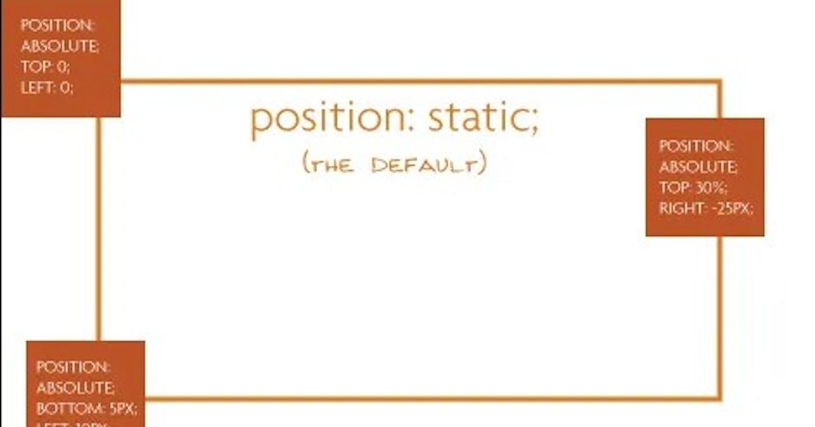
Static positioning
The static positioning of the position property, is the default position of all HTML elements. This means all HTML elements are statically positioned by default. When you add the position property to a style, you automatically activate its children property (top, right, bottom and left). This children property helps in positioning of the HTML element in the DOM. With the static positioning, these children would have no effect because the Static positioning is the same as the original default flow of HTML elements.
NOTE: Top property moves the element downwards,Right property moves the element to the left, Bottom property moves the element upwards and Left property moves the element to the right.
Relative positioning
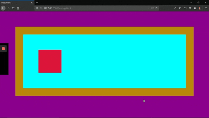
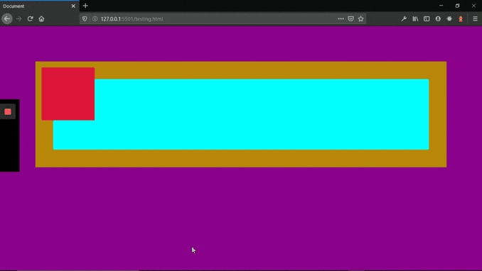
This is basically a shift from an element's original position (static position), to a position relative to it i.e the new position which the element has moved to, is calculated from its original position (static position). For instance in the code below, if the class of relative is added to the middle DIV element, you will notice that the middle DIV element will move from its original position, 20px downwards and 50px to the right hand side. (see the image illustration below).
<!DOCTYPE HTML>
<HTML lang="en">
<head>
    <meta charset="UTF-8">
    <title>Relative Positioning</title>
    <style>
         div{
             width: 100%;
             height: 30vh;
          }

          div:nth-child(1){
            background-color: aqua;
          }

          div:nth-child(2){
            background-color: crimson;
          }

         div:nth-child(3){
            background-color: darkgoldenrod;
         }

         .relative {
           position: relative;
           top: 20px;
           left: 50px;
         }

    </style>
</head>
<body>
<div></div>
<div class="relative"></div>
<div></div>
</body>
</HTML>
voila!!!
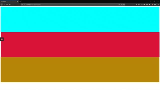
Notice that as the red-colored DIV element moves away from its original position, the other DIV elements do not adjust. If the red-colored DIV element is to move downwards by 30vh, its original space will be left untouched.
Fixed positioning
The fixed position is a position that leaves the original flow and acts like a sticker on a page. The fixed position is relative to the view-port of the user. This means the element with a fixed position calculates it’s position using the users view-port. Lets understand more by writing code that will make a DIV element have a fixed position.
<!DOCTYPE HTML>
<HTML lang="en">
<head>
    <meta charset="UTF-8">
    <title>Fixed Positioning</title>
    <style>
           div{
                 width: 100%;
                 height: 30vh;
           }

           div:nth-child(odd){
                background-color: aqua;
           }

           div:nth-child(even){
               background-color: darkgoldenrod;
           }

          .fixed {
              width: 150px;
              height: 50px;
              display: flex;
              justify-content: center;
             align-items: center;
             color: #ffffff;
             background-color: crimson !important;
             position: fixed;
             bottom: 45px;
             right:40px ;
         }

    </style>
</head>
<body>
    <div></div>
    <div class="fixed"><p>This is fixed!!!</p></div>
    <div></div>
    <div></div>
    <div></div>
    <div></div>
    <div></div>
    <div></div>
    <div></div>
    <div></div>
    <div></div>
    <div></div>
    <div></div>
</body>
</HTML>
In the code above, I added more DIV elements so the page can be scroll-able and I styled the fixed class more so we can have a better understanding. The result is as follows.
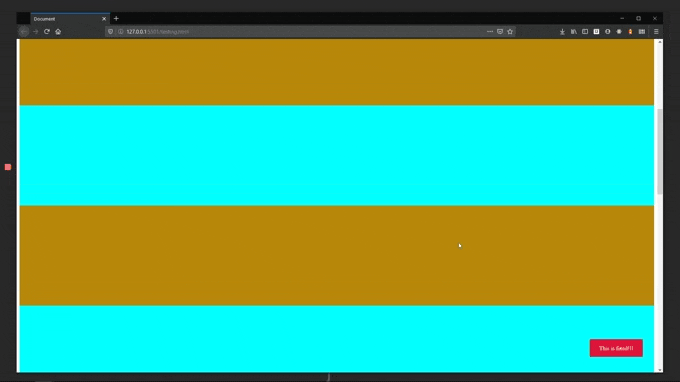
Notice:
- The fixed DIV element is stationed 45px away from the bottom and 40px away from the right side.
- There is no space reserved for it in the DOM that is why we have two aqua-colored DIV elements first before the normal flow. The fixed DIV element was meant to be in between them.
- Also, because the fixed DIV element is positioned relative to the view-port, it always recalculates itself to make sure it is stationed 45px away from the bottom and 40px away from the right side.
TIP: This positioning is used for chat-boxes, and “back to the top buttons”.
Absolute positioning
Absolute positioning is positioning an element relative to any of its parents with a position property. This means an element with absolute positioning would check for the close parent element that has a position element too and then calculates its position from that point. If there is no parent element with a position property, it will calculate its position from the body element. Static positioning is not regarded in this case.
Absolute positioning is a little bit tricky so let’s dive straight in. If we use the code in our fixed position example , we can change the position to absolute and see the effect below.
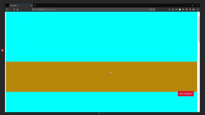
Wait! What is happening? How is absolute positioning been calculated? Let me break it down more. To know how an element with absolute positioning calculates where to position itself, it will check for any parent element with a position property. If there is any parent element with a position of property (static position not included because it is the default positioning of all HTML elements), the element with the absolute property will calculate where to stay based on that parent element.
Let's say we have the below code of nested DIV elements.
<!DOCTYPE HTML>
<HTML lang="en">
<head>
    <meta charset="UTF-8">
    <meta name="viewport" content="width=device-width, initial-scale=1.0">
    <meta http-equiv="X-UA-Compatible" content="ie=edge">
    <title>Absolute Positioning</title>
    <style>
          *{
               margin: 0;
               padding: 0;
               box-sizing: border-box;
           }

           body{
                display: flex;
                justify-content: center;
               align-items: center;
               background-color: darkmagenta;
               padding: 100px;
         }

         .div{
              width: 100%;
              height: 80%;
              background-color: darkgoldenrod;
              position: relative;
              padding: 50px;
         }

        .div > .child-div {
             width: 100%;
             height: 100%;
             background-color: aqua;
             padding: 100px;
        }

       .div > .child-div > div {
            width: 150px;
            height: 150px;
            background-color: crimson;
            position: absolute;
      }

    </style>
</head>
<body>
    <div class="div">
        <div class="child-div">
            <div>
            </div>
        </div>
    </div>
</body>
</HTML>
Notice that the last nested DIV element has a position of absolute and the first DIV element which is the container for everything, has a position of relative. With this, the result will be the picture below
The DIV element with position absolute checks for any parent DIV element with a Position property and finds the DIV element with the dark-goldenrod-color so it starts its calculation from there. This makes it leave its original position and moves to a position 20px from the left and right respectively from the dark-goldenrod-color DIV element.
But if no parent element is found with a position property, the red-colored DIV element starts calculating from the body element. And as you can see in the next frame, it jumps over all the existing elements to stay in a position 20px from the left and right respectively from the body tag.
Notice that:
- In the first example of the absolute positioning, the element used the body tag to calculate.
- The absolute positioning still moves with the flow of the page, that is why on scroll of a page, an element with absolute positioning will disappear when you scroll past it. This is the basic difference between absolute positioning and fixed positioning.
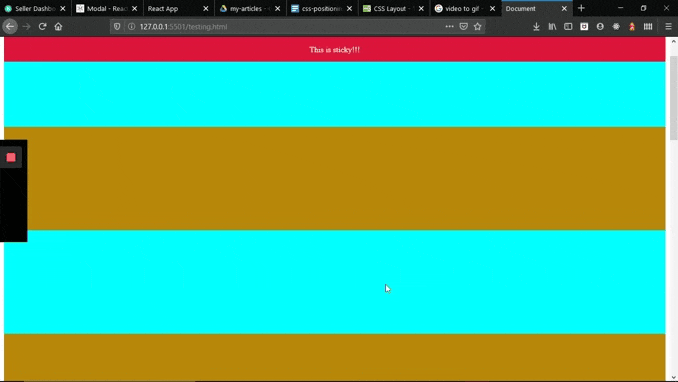
Sticky positioning:
A sticky position makes an element stay in its original position until the page is scrolled. When scrolling of the page starts, the position of the element changes from relative to fixed. This now makes it to float like a fixed position element, while the page scrolls pass. An example is a floating header like the one shown below.
To get this, simply change the .fixed class in the Fixed position to .sticky below.
.sticky {
    width: 100%;
    height: 50px;
    display: flex;
    justify-content: center;
    align-items: center;
    color: #fff;
    background-color: crimson !important;
    position: -webkit-sticky; /* Safari */
    position: sticky;
    top: 0;
}
Notice that: Only top was used, if you use Top and any other combined? It would not work.
TIP: This can be used for your floating header/ navigation.
Positioning can not only be done on the y-axis and x-axis but also on the z-axis. Thia brings us to another CSS property called z-index.
NOTE: The y-axis is the vertical placement of HTML elements, while the x-axis is the horizontal placement of HTML elements.
z-index
The z-index is used to choose which HTML element stays above each other. This can happen when HTML elements overlap, which can be caused by positioning HTML elements above each other. For example of HTML element positioning above another HTML element, see Fixed positioning which i previously talked about in this article. To experiment with the z-index property, add this class
.overlap{
  position:absolute;
  x-index:100;
}
to any of the DIV element in the Fixed positioning example above and also add z-index: 5; to the Fixed HTML element and then stroll up and down to see the effect.
NOTE: This is an exercise to make sure you practice all that you just read. 😉 To make this fun, you can create a page with multiple images of same size (same height and width) and put them in same position. Then use the z-index property on each image to see how it changes position.
PRO TIP: When a HTML element is on position absolute, and there is no parent HTML element with a position property, any padding or margin from a parent HTML element will not affect the HTML element with the position property.
Conclusion
We talked about the five different types of positioning, which are static to relative, fixed, Absolute and Sticky and how we can use them to manipulate the flow of elements in the DOM. We also talked about the x-index property and how we can use on overlapping HTML elements. With your newly found powers, You can experiment and become the web magician you want. Happy coding!!!